Redesigning the Medication Service for Uw Zorg Online
Summary
Together with a UX design colleague, I worked on redesigning the medication service of Uw Zorg Online. I focused on research, accessibility testing, and iterative design to create a combined GP and pharmacy experience that makes finding, ordering, and managing medication clearer and more accessible for users.
Project: Combined Medication ServiceCompany: Uw Zorg OnlineRole: UX/UI Designer - collaboration with UX team
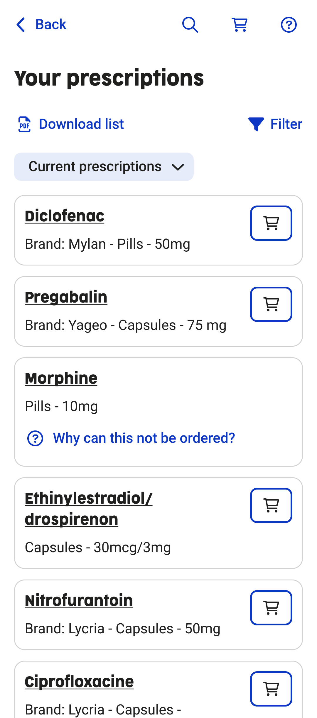
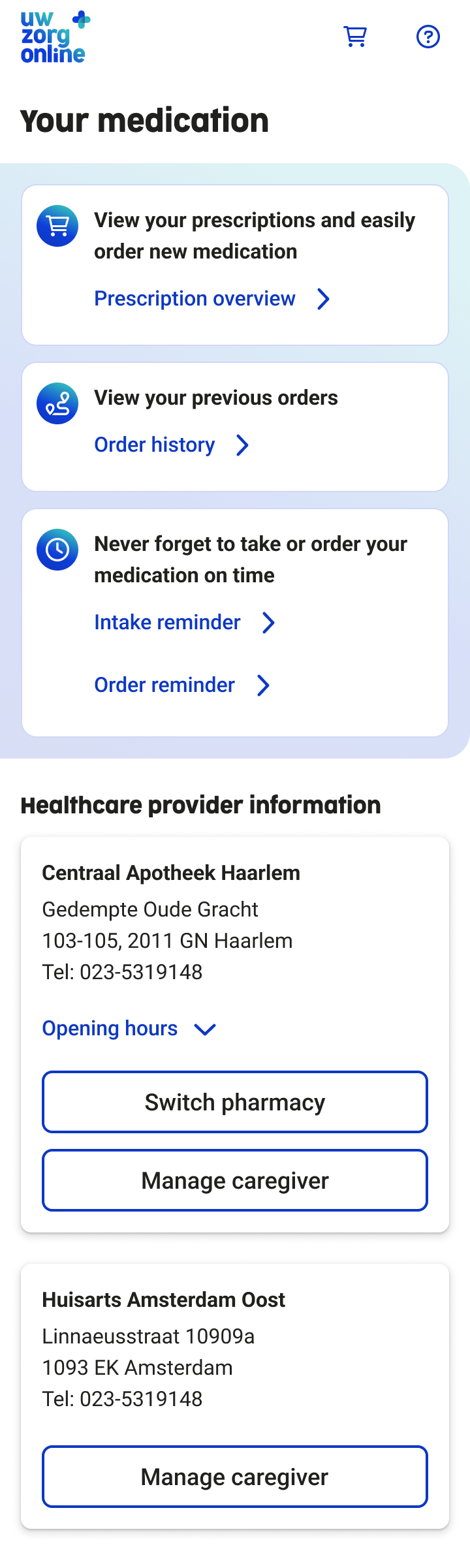
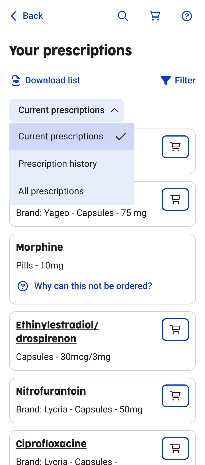
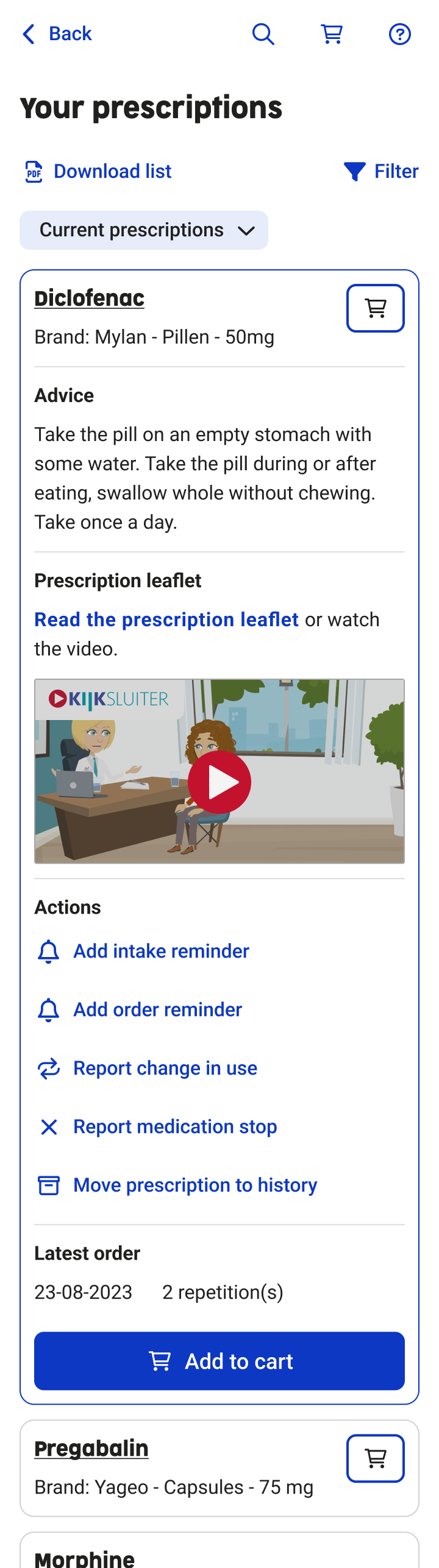
Design of prescription overview
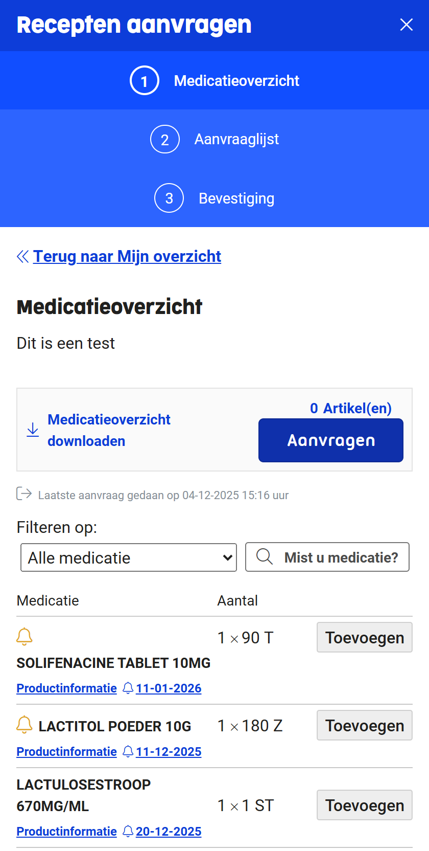
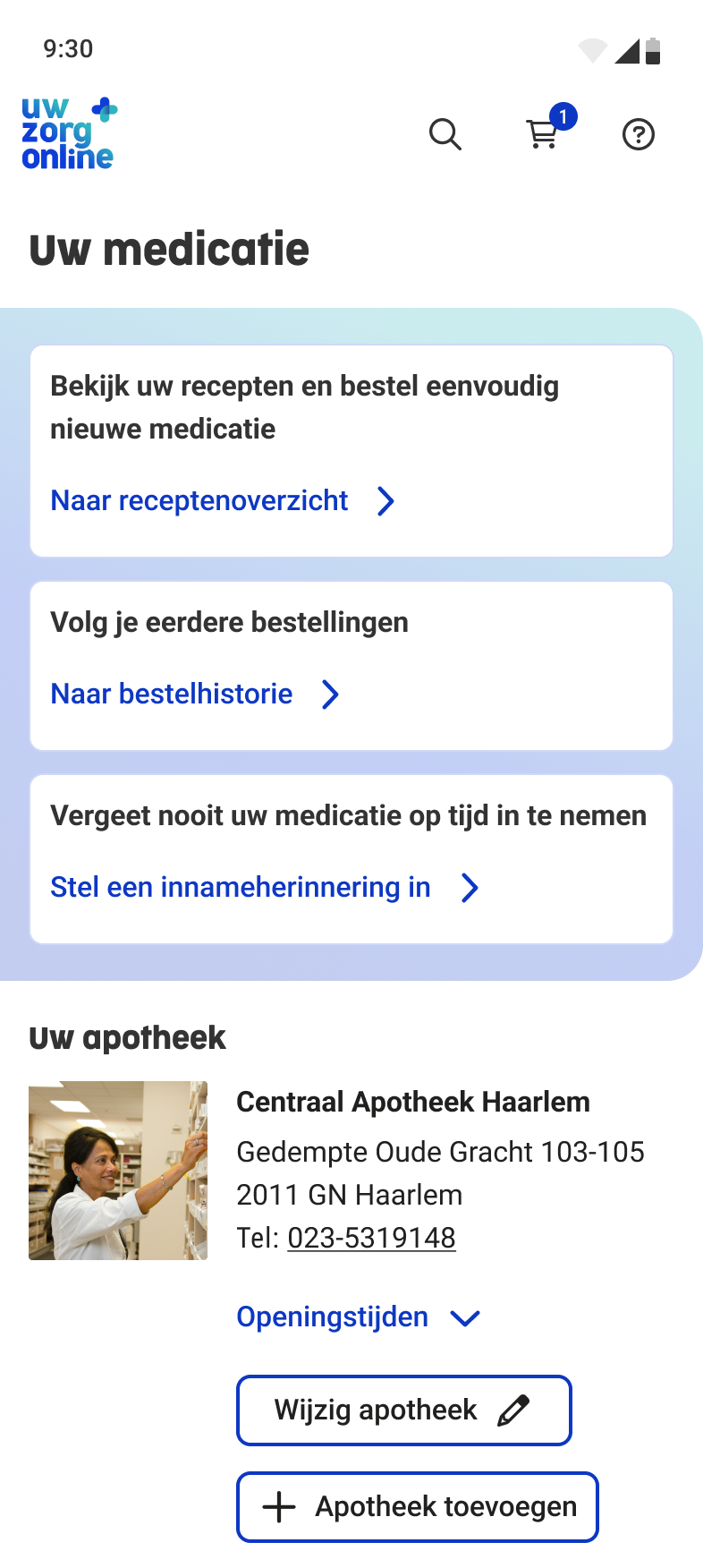
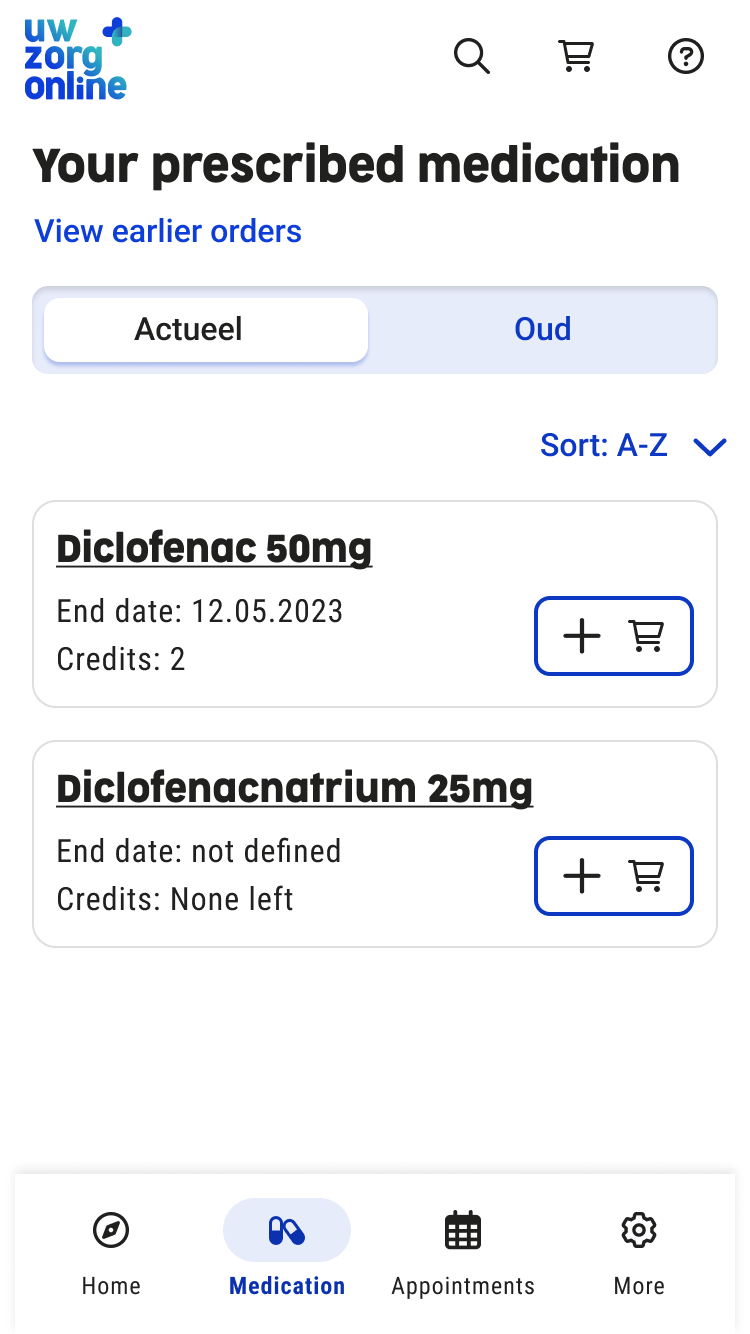
Old medication service
Context and goals
Context
This project was an internal assignment at Uw Zorg Online. The goal was not only to improve the user interface, but to redesign the entire medication service, including the underlying service flow and collaboration between healthcare providers.
Goals
- Increase satisfaction among existing clients (general practitioners and pharmacies).
- Improve user satisfaction for healthcare consumers.
- Make Uw Zorg Online more attractive for new pharmacies and pharmacy chains by leveraging the unique combination of GP and pharmacy systems.
Discover and define
Research methods
- Analysis of pain points in the existing medication service using Mopinion.
- Creation of a persona and user journey to understand user needs and frustrations.
- Usability testing with a strong focus on accessibility, conducted with:
- people with visual impairments,
- people with dyslexia,
- people with neurological conditions.
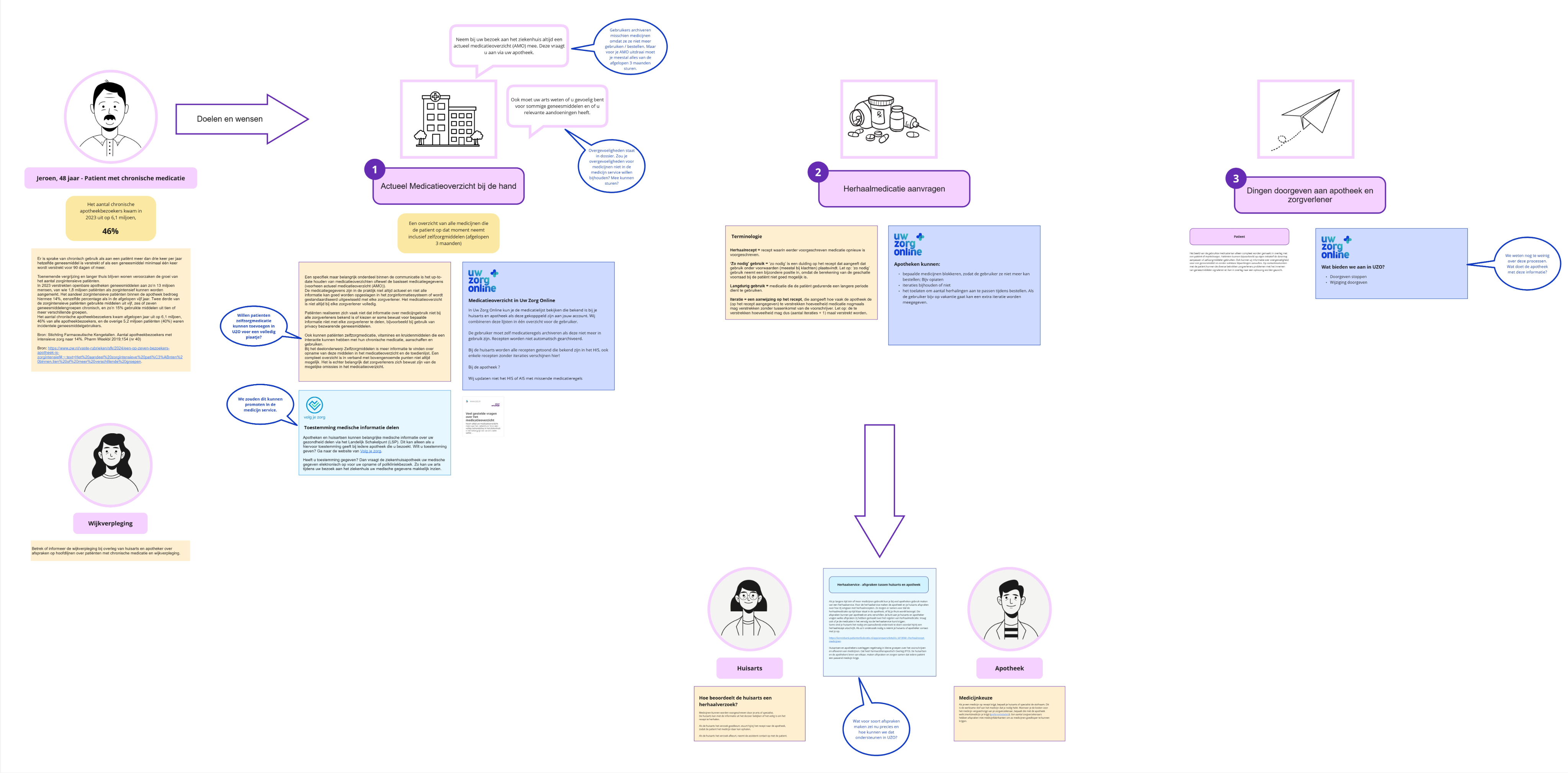
Persona of user using chronic medication
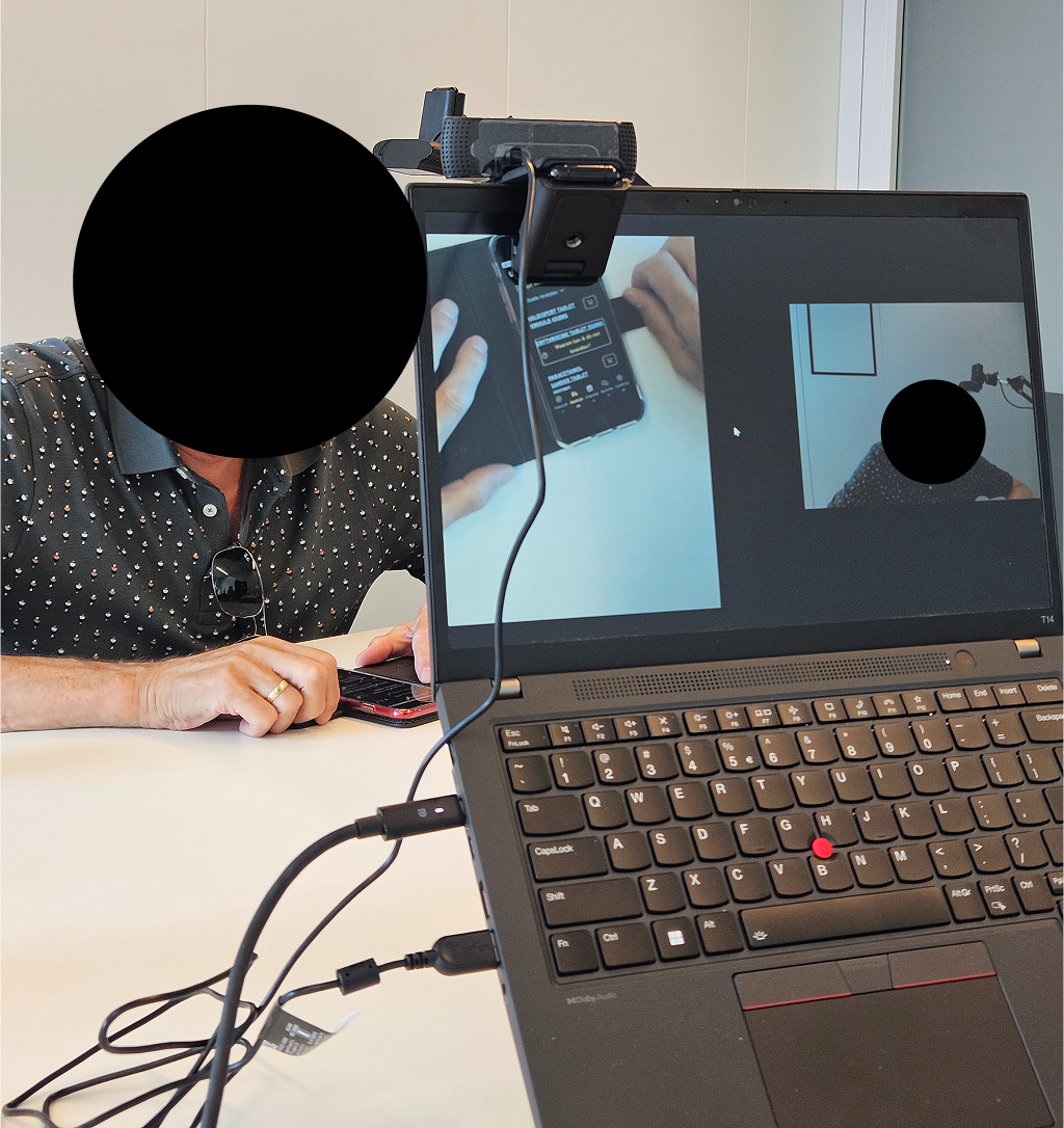
Usability test with blind user (focus on accessibility)
Goals
- Increase satisfaction among existing clients (general practitioners and pharmacies).
- Improve user satisfaction for healthcare consumers.
- Make Uw Zorg Online more attractive for new pharmacies and pharmacy chains by leveraging the unique combination of GP and pharmacy systems.
Problem statement
Users of the medication service struggle to find and order their medication because they have to switch between different healthcare providers and the interface is not intuitive. As a result, users experience confusion and frustration.
They need a single, combined medication service where all medication can be clearly found and ordered in one place.
Ideation and concepting
Approach
- Design techniques used: sketching, wireframes, and prototyping.
- Multiple internal feedback sessions with:
- Product Owner
- UX Lead and UX Designer
- Front-end and back-end developers
Problem statement
A combined medication service where users can add both a pharmacy and a GP. In the backend, the system automatically determines which healthcare provider receives the prescription request, for example based on the number of prescription repeats.
Why This Concept?
- Users have all their medication in a single overview.
- It eliminates confusion and unnecessary switching between systems.
- The concept is technically feasible: existing integrations with GP and pharmacy systems already support this flow.
- The concept was validated in collaboration with the Product Owner and development team.
Prototyping and Iterations
What I Designed
- Multiple design iterations, from early concepts to a high-fidelity prototype.
- UI and interaction updates based on continuous feedback.
- Designs aligned with the new Uw Zorg Online design system.
Key Iterations
- Prescription overview, medication home overview, order flow, order reminder flow, intake reminder flow
- Multiple use cases and scenarios worked out
- Bad flows worked out
Medication start screen iterations
Medication start screen - Final screen
Prescription overview - iterations
Prescription overview - Final screen
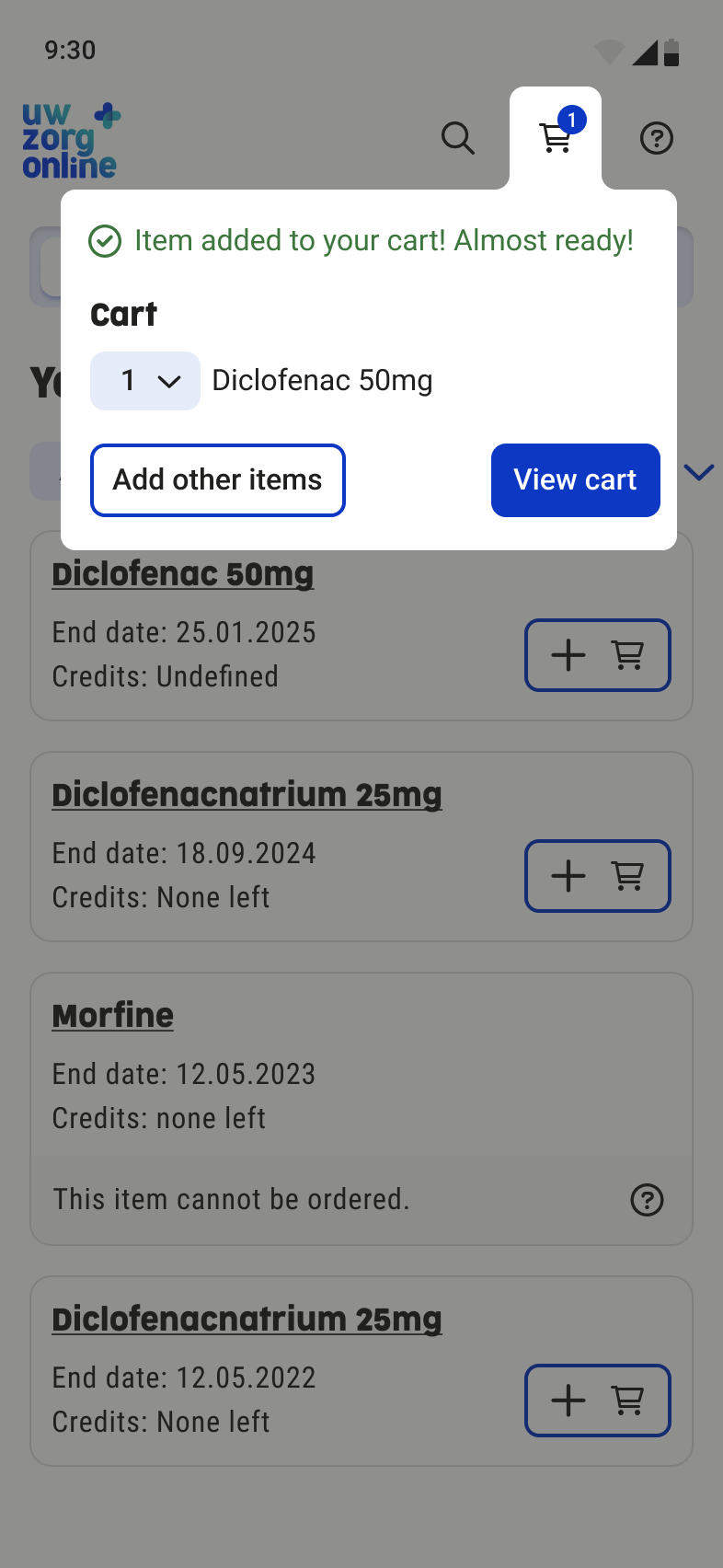
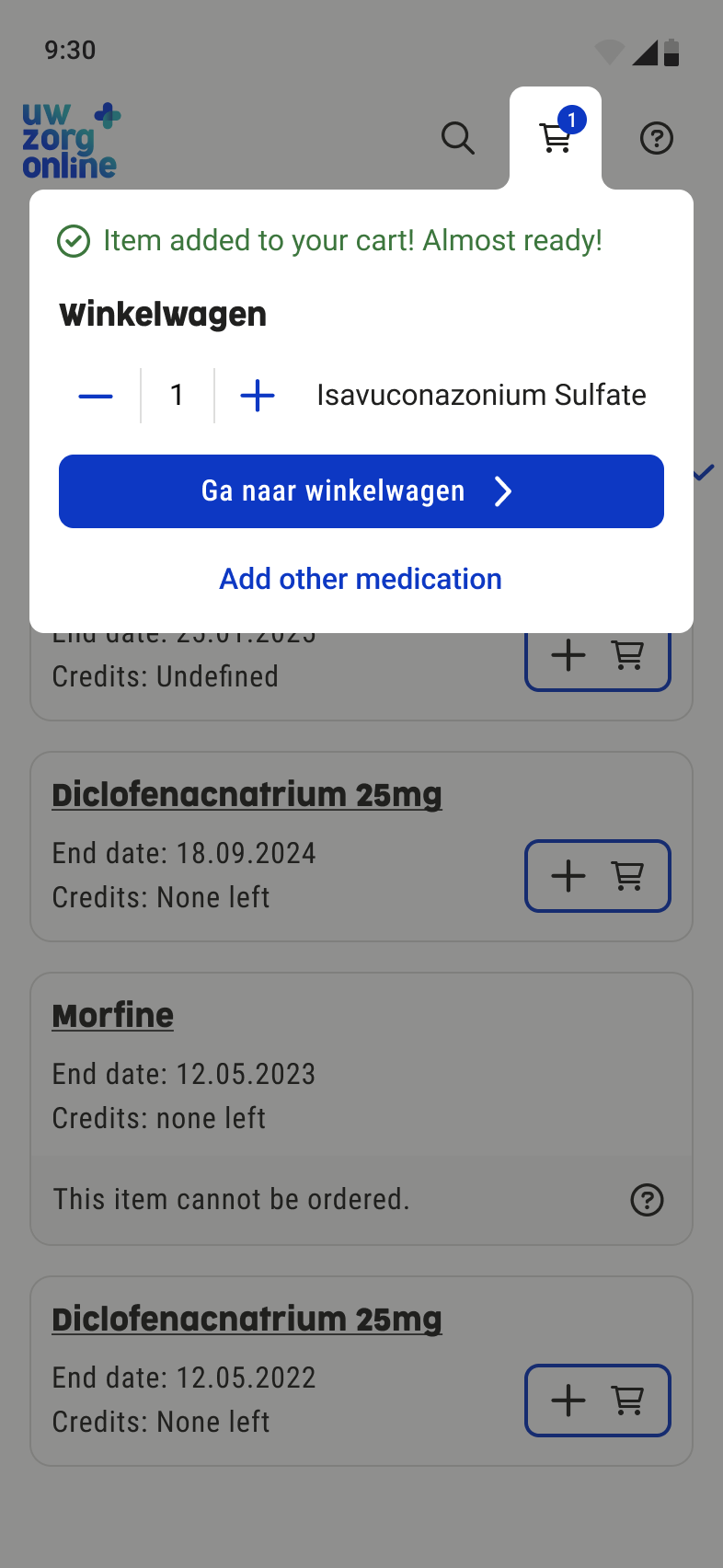
Medication cart dialog - iterations
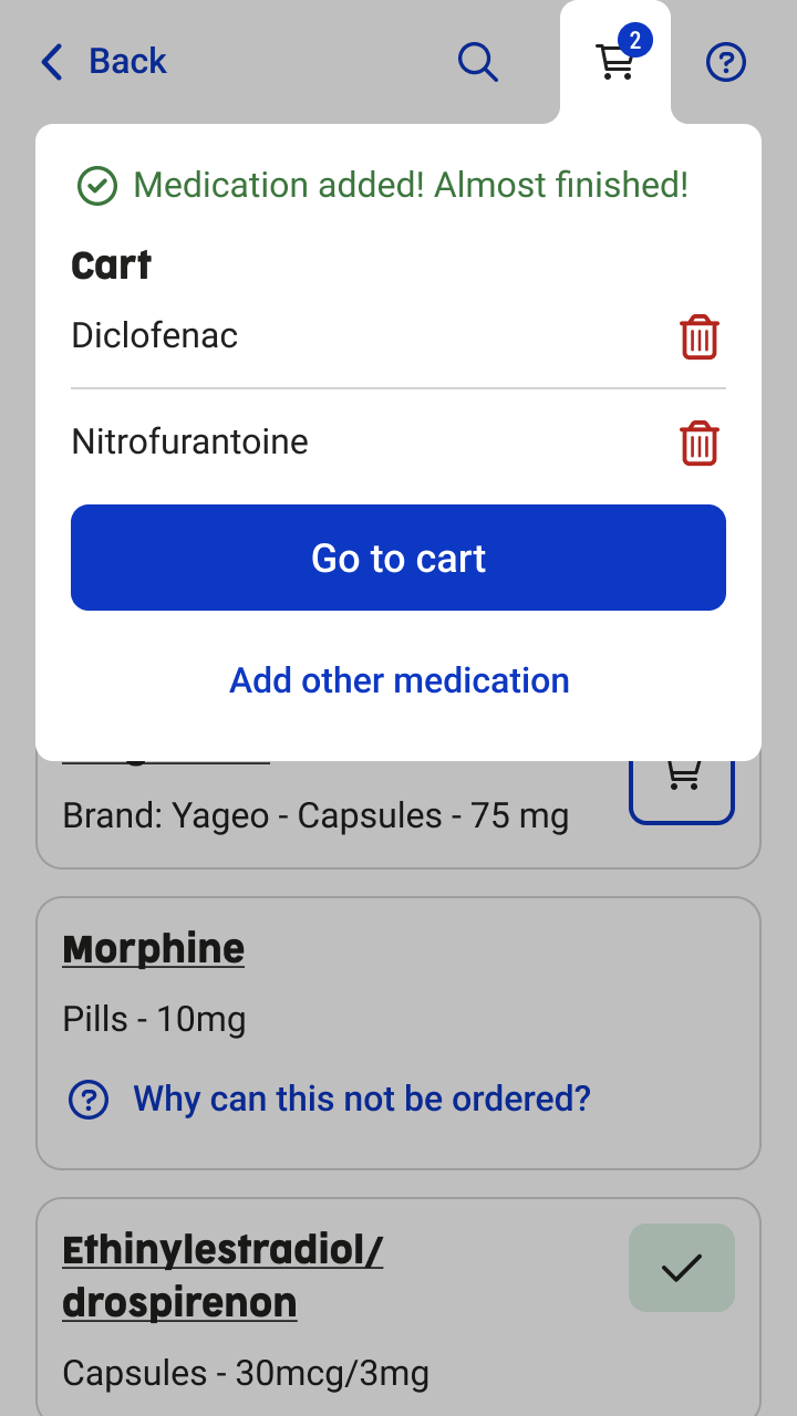
Medication cart dialog - Final screen
Order overview - iterations
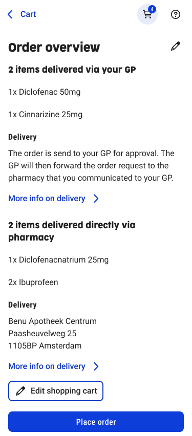
Order overview - Final screen
Usability Testing
Test Round 1 – Figma prototype
- Method: usability testing
- Participants: 3 users without impairments
- Tasks:
- Order a medication item
- Set a reorder reminder
Key Findings & Improvements test round 1
- Users did not notice that a medication item could be expanded.→ Improvement: the medication title was underlined to indicate interactivity.
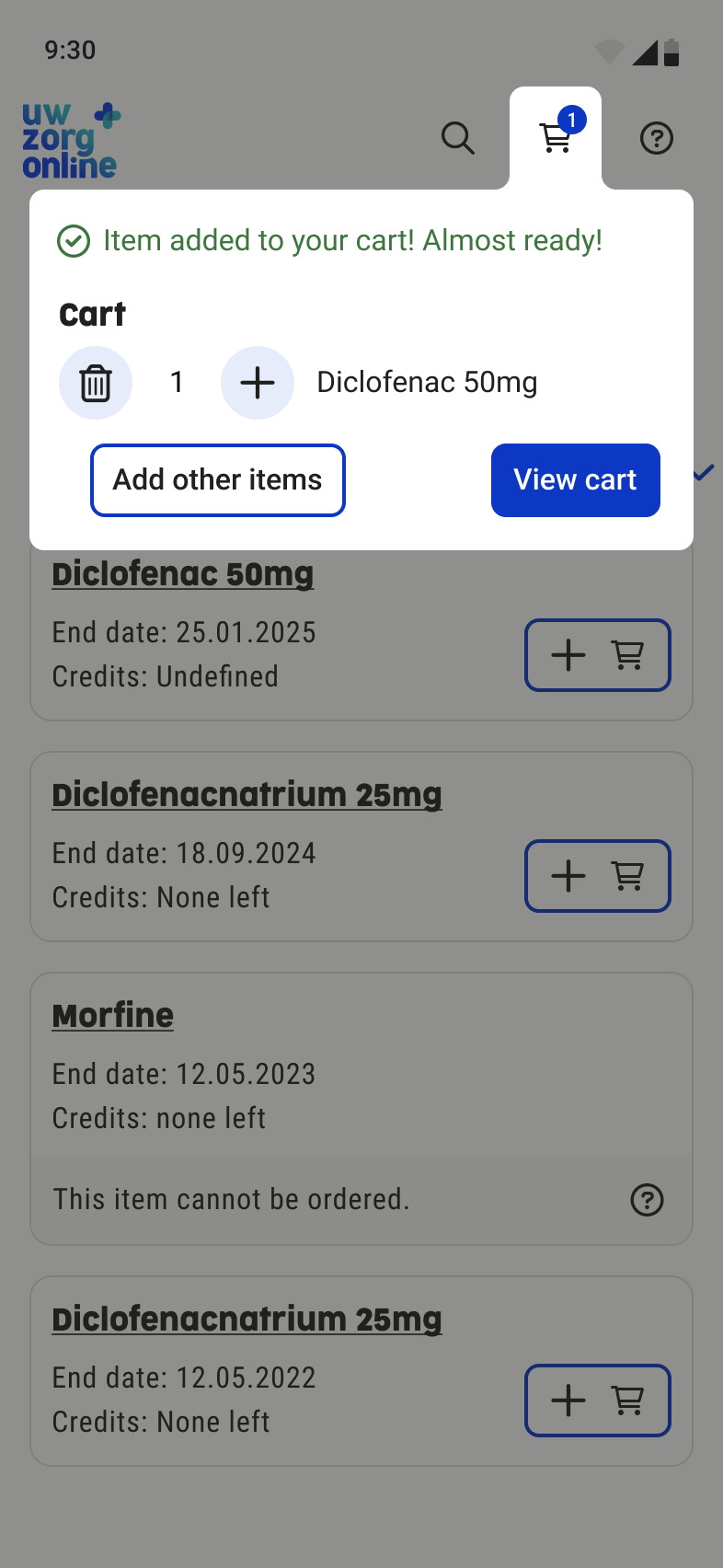
- Users assumed medication was ordered immediately after adding it to the cart.→ Improvement: the cart dialog opens automatically after adding an item to the cart and clearly shows a CTA: “Go to cart”.
- The reorder reminder was perceived as intuitive and easy to use.
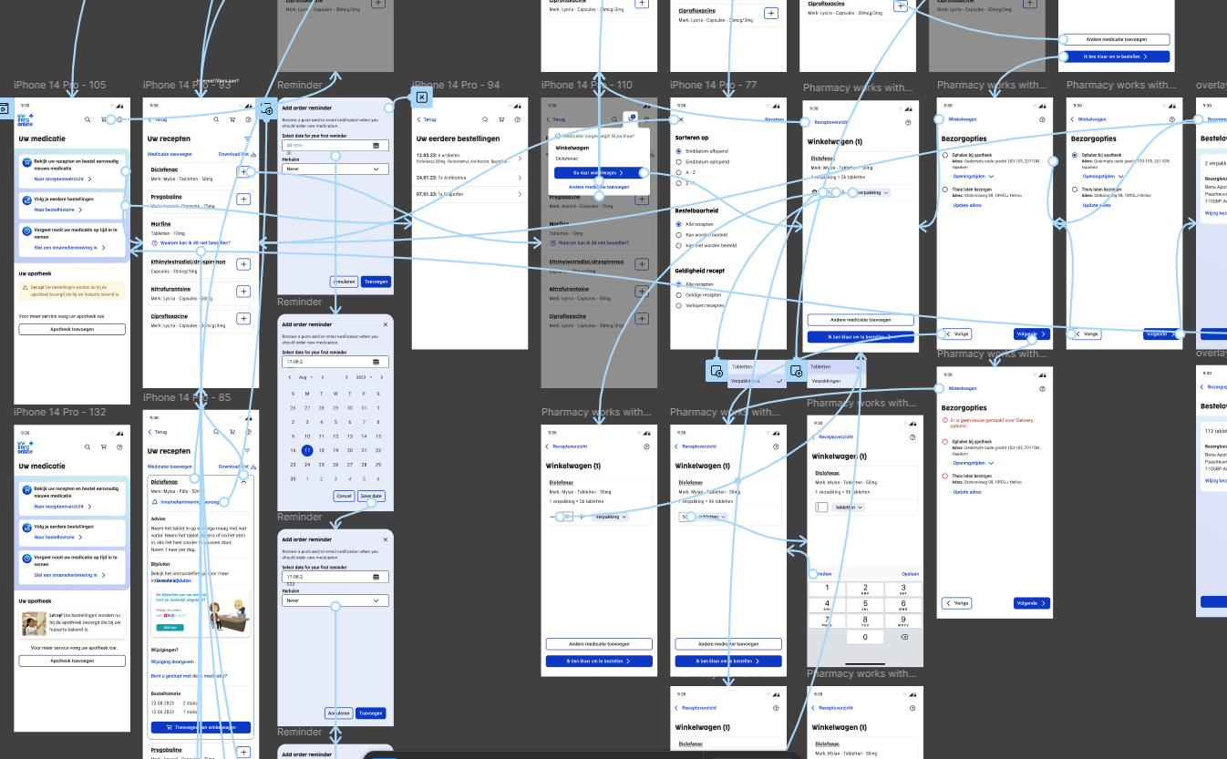
Figma prototype of medication usability test
Test Round 2 – 5 Months After Release
- Method: usability testing with a focus on accessibility
- Conducted together with an accessibility officer
- Participants:
- 3 users with visual impairments (2 blind, 1 low-vision/contrast only)
- 1 user with a neurological condition (only has good vision with 1 eye)
Key Findings test round 2
- For blind users, the content order was confusing, causing them to miss the main content and get lost in the UI.
- The cart dialog remained open while the screen reader navigated the page, creating conflicting feedback.
- When setting a reorder reminder, the medication name was not clearly announced by screen readers.
These issues were documented and scheduled as improvements for a future release, as they require technical changes from the development team.
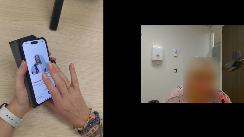
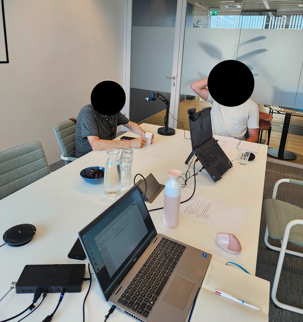
Medication usability test with a blind user (focus on accessibility)
Final Solution and Outcome
The Solution
The redesigned medication service provides users with a clear and intuitive way to find, view, and order their medication. By combining GP and pharmacy systems, users now have one central overview instead of switching between separate environments.
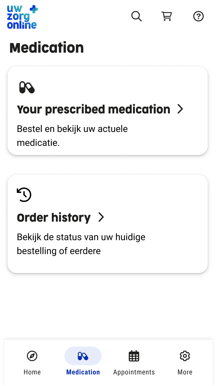
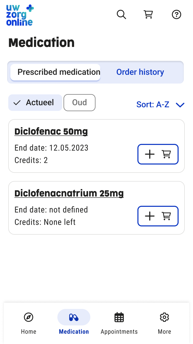
Final UI screens
Key Features
- Ordering medication: requests are automatically sent to the correct healthcare provider, reducing errors and speeding up the process.
- Medication overview: always up to date through data from both GP and pharmacy systems. Users can move medication to “history” and back, giving them control over their overview.
- Reorder reminders: users can set reminders to reorder medication on time.
- Intake reminders: users can set reminders to take their medication on time.
Reflections and learning
- This project taught me how to set up, conduct, and analyze usability tests with users with disabilities, significantly improving my understanding of accessibility.
- I also learned how to create clear and detailed handovers for development and Product Owners, including both ideal flows and edge cases.
- In future projects, I would involve Product Owners and developers earlier in the design process to identify technical or functional constraints sooner.
- Overall, this project strongly improved my skills in iteration and usability testing, which I have applied in subsequent projects.


©All Rights Reserved
Accessibility
Privacy Policy
Redesigning the Medication Service for Uw Zorg Online
Summary
Together with a UX design colleague, I worked on redesigning the medication service of Uw Zorg Online. I focused on research, accessibility testing, and iterative design to create a combined GP and pharmacy experience that makes finding, ordering, and managing medication clearer and more accessible for users.
Project: Combined Medication ServiceCompany: Uw Zorg OnlineRole: UX/UI Designer - collaboration with UX team
Design of prescription overview
Old medication service
Context and goals
Context
This project was an internal assignment at Uw Zorg Online. The goal was not only to improve the user interface, but to redesign the entire medication service, including the underlying service flow and collaboration between healthcare providers.
Goals
- Increase satisfaction among existing clients (general practitioners and pharmacies).
- Improve user satisfaction for healthcare consumers.
- Make Uw Zorg Online more attractive for new pharmacies and pharmacy chains by leveraging the unique combination of GP and pharmacy systems.
Discover and define
Research methods
- Analysis of pain points in the existing medication service using Mopinion.
- Creation of a persona and user journey to understand user needs and frustrations.
- Usability testing with a strong focus on accessibility, conducted with:
- people with visual impairments,
- people with dyslexia,
- people with neurological conditions.
Persona of user using chronic medication
Usability test with blind user (focus on accessibility)
Goals
- Increase satisfaction among existing clients (general practitioners and pharmacies).
- Improve user satisfaction for healthcare consumers.
- Make Uw Zorg Online more attractive for new pharmacies and pharmacy chains by leveraging the unique combination of GP and pharmacy systems.
Problem statement
Users of the medication service struggle to find and order their medication because they have to switch between different healthcare providers and the interface is not intuitive. As a result, users experience confusion and frustration.
They need a single, combined medication service where all medication can be clearly found and ordered in one place.
Ideation and concepting
Approach
- Design techniques used: sketching, wireframes, and prototyping.
- Multiple internal feedback sessions with:
- Product Owner
- UX Lead and UX Designer
- Front-end and back-end developers
Problem statement
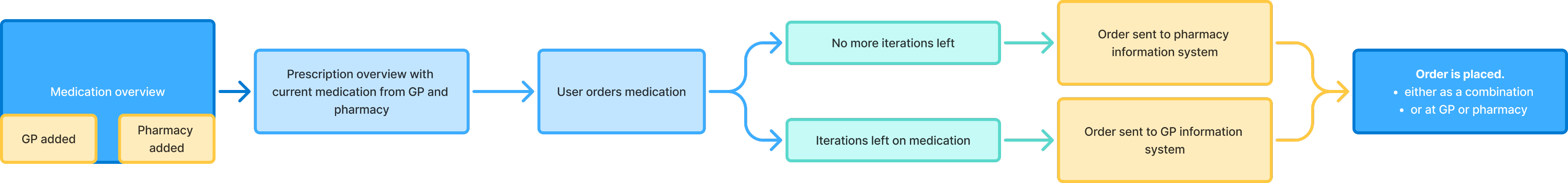
A combined medication service where users can add both a pharmacy and a GP. In the backend, the system automatically determines which healthcare provider receives the prescription request, for example based on the number of prescription repeats.
Why This Concept?
- Users have all their medication in a single overview.
- It eliminates confusion and unnecessary switching between systems.
- The concept is technically feasible: existing integrations with GP and pharmacy systems already support this flow.
- The concept was validated in collaboration with the Product Owner and development team.
Prototyping and Iterations
What I Designed
- Multiple design iterations, from early concepts to a high-fidelity prototype.
- UI and interaction updates based on continuous feedback.
- Designs aligned with the new Uw Zorg Online design system.
Key Iterations
- Prescription overview, medication home overview, order flow, order reminder flow, intake reminder flow
- Multiple use cases and scenarios worked out
- Bad flows worked out
Medication start screen iterations
Medication start screen - Final screen
Prescription overview - iterations
Prescription overview - Final screen
Medication cart dialog - iterations
Medication cart dialog - Final screen
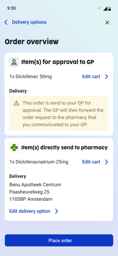
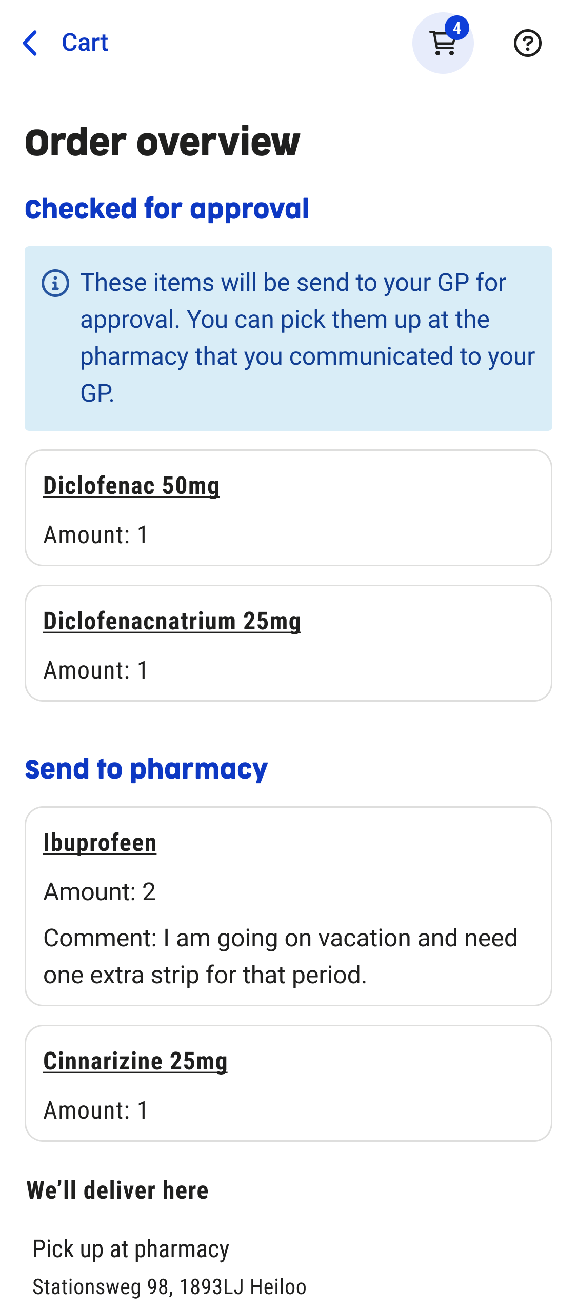
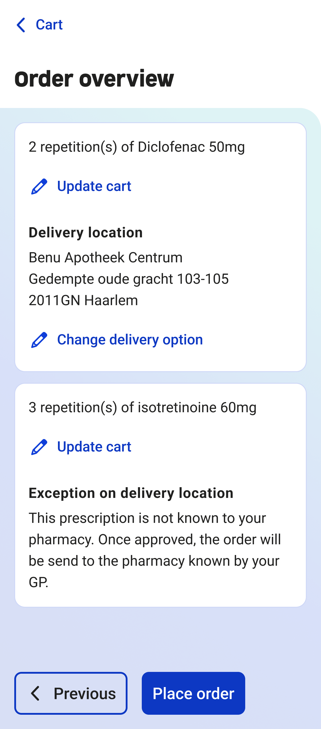
Order overview - iterations
Order overview - Final screen
Usability Testing
Test Round 1 – Figma prototype
- Method: usability testing
- Participants: 3 users without impairments
- Tasks:
- Order a medication item
- Set a reorder reminder
Key Findings & Improvements test round 1
- Users did not notice that a medication item could be expanded.→ Improvement: the medication title was underlined to indicate interactivity.
- Users assumed medication was ordered immediately after adding it to the cart.→ Improvement: the cart dialog opens automatically after adding an item to the cart and clearly shows a CTA: “Go to cart”.
- The reorder reminder was perceived as intuitive and easy to use.
Figma prototype of medication usability test
Test Round 2 – 5 Months After Release
- Method: usability testing with a focus on accessibility
- Conducted together with an accessibility officer
- Participants:
- 3 users with visual impairments (2 blind, 1 low-vision/contrast only)
- 1 user with a neurological condition (only has good vision with 1 eye)
Key Findings test round 2
- For blind users, the content order was confusing, causing them to miss the main content and get lost in the UI.
- The cart dialog remained open while the screen reader navigated the page, creating conflicting feedback.
- When setting a reorder reminder, the medication name was not clearly announced by screen readers.
These issues were documented and scheduled as improvements for a future release, as they require technical changes from the development team.
Medication usability test with a blind user (focus on accessibility)
Final Solution and Outcome
The Solution
The redesigned medication service provides users with a clear and intuitive way to find, view, and order their medication. By combining GP and pharmacy systems, users now have one central overview instead of switching between separate environments.
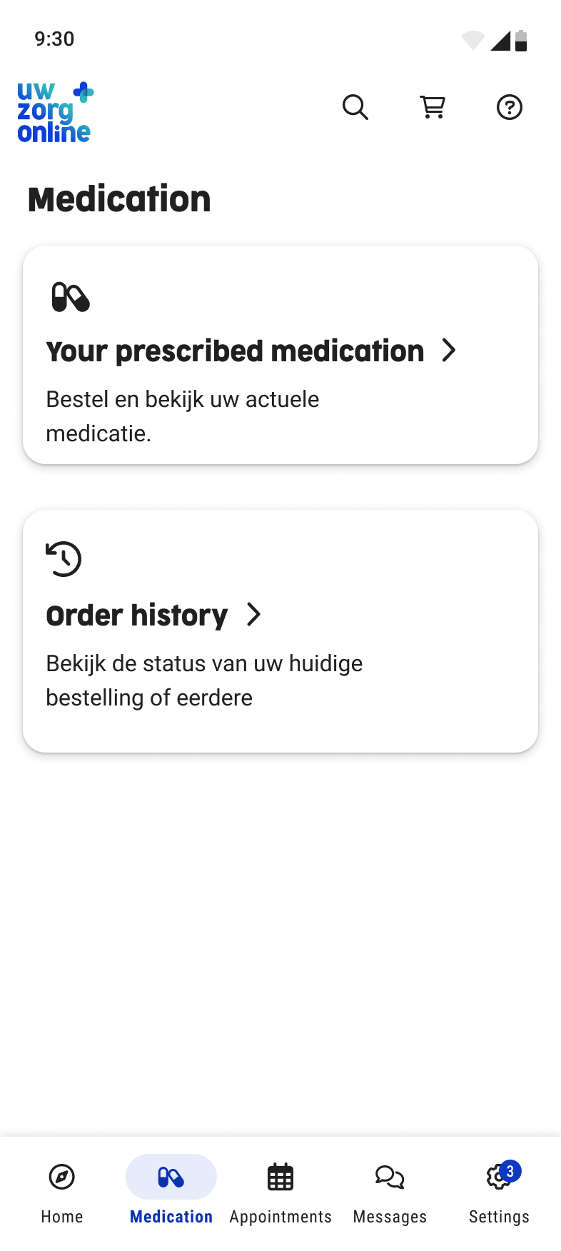
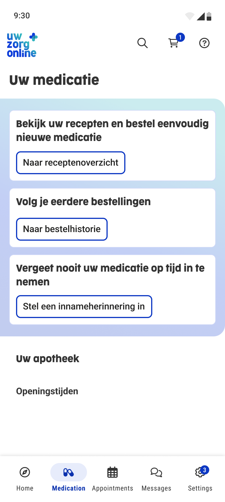
Final UI screens
Key Features
- Ordering medication: requests are automatically sent to the correct healthcare provider, reducing errors and speeding up the process.
- Medication overview: always up to date through data from both GP and pharmacy systems. Users can move medication to “history” and back, giving them control over their overview.
- Reorder reminders: users can set reminders to reorder medication on time.
- Intake reminders: users can set reminders to take their medication on time.
Reflections and learning
- This project taught me how to set up, conduct, and analyze usability tests with users with disabilities, significantly improving my understanding of accessibility.
- I also learned how to create clear and detailed handovers for development and Product Owners, including both ideal flows and edge cases.
- In future projects, I would involve Product Owners and developers earlier in the design process to identify technical or functional constraints sooner.
- Overall, this project strongly improved my skills in iteration and usability testing, which I have applied in subsequent projects.

©All Rights Reserved
Accessibility
Privacy Policy

Redesigning the Medication Service for Uw Zorg Online
Summary
Together with a UX design colleague, I worked on redesigning the medication service of Uw Zorg Online. I focused on research, accessibility testing, and iterative design to create a combined GP and pharmacy experience that makes finding, ordering, and managing medication clearer and more accessible for users.
Project: Combined Medication ServiceCompany: Uw Zorg OnlineRole: UX/UI Designer - collaboration with UX team
Design of prescription overview
Old medication service
Context and goals
Context
This project was an internal assignment at Uw Zorg Online. The goal was not only to improve the user interface, but to redesign the entire medication service, including the underlying service flow and collaboration between healthcare providers.
Goals
- Increase satisfaction among existing clients (general practitioners and pharmacies).
- Improve user satisfaction for healthcare consumers.
- Make Uw Zorg Online more attractive for new pharmacies and pharmacy chains by leveraging the unique combination of GP and pharmacy systems.
Discover and define
Research methods
- Analysis of pain points in the existing medication service using Mopinion.
- Creation of a persona and user journey to understand user needs and frustrations.
- Usability testing with a strong focus on accessibility, conducted with:
- people with visual impairments,
- people with dyslexia,
- people with neurological conditions.
Persona of user using chronic medication
Usability test with blind user (focus on accessibility)
Goals
- Increase satisfaction among existing clients (general practitioners and pharmacies).
- Improve user satisfaction for healthcare consumers.
- Make Uw Zorg Online more attractive for new pharmacies and pharmacy chains by leveraging the unique combination of GP and pharmacy systems.
Problem statement
Users of the medication service struggle to find and order their medication because they have to switch between different healthcare providers and the interface is not intuitive. As a result, users experience confusion and frustration.
They need a single, combined medication service where all medication can be clearly found and ordered in one place.
Ideation and concepting
Approach
- Design techniques used: sketching, wireframes, and prototyping.
- Multiple internal feedback sessions with:
- Product Owner
- UX Lead and UX Designer
- Front-end and back-end developers
Chosen concept
A combined medication service where users can add both a pharmacy and a GP. In the backend, the system automatically determines which healthcare provider receives the prescription request, for example based on the number of prescription repeats.
Why This Concept?
- Users have all their medication in a single overview.
- It eliminates confusion and unnecessary switching between systems.
- The concept is technically feasible: existing integrations with GP and pharmacy systems already support this flow.
- The concept was validated in collaboration with the Product Owner and development team.
Prototyping and Iterations
What I Designed
- Multiple design iterations, from early concepts to a high-fidelity prototype.
- UI and interaction updates based on continuous feedback.
- Designs aligned with the new Uw Zorg Online design system.
Key Iterations
- Prescription overview, medication home overview, order flow, order reminder flow, intake reminder flow
- Multiple use cases and scenarios worked out
- Bad flows worked out
Medication start screen iterations
Medication start screen - Final screen
Prescription overview - iterations
Prescription overview - Final screen
Medication cart dialog - iterations
Medication cart dialog - Final screen
Order overview - iterations
Order overview - Final screen
Usability Testing
Test Round 1 – Figma prototype
Method: usability testing
- Participants: 3 users without impairments
- Tasks:
- Order a medication item
- Set a reorder reminder
Key Findings & Improvements test round 1
- Users did not notice that a medication item could be expanded.→ Improvement: the medication title was underlined to indicate interactivity.
- Users assumed medication was ordered immediately after adding it to the cart.→ Improvement: the cart dialog opens automatically after adding an item to the cart and clearly shows a CTA: “Go to cart”.
- The reorder reminder was perceived as intuitive and easy to use.
Figma prototype of medication usability test
Test Round 2 – 5 Months After Release
Method: usability testing with a focus on accessibility
- Conducted together with an accessibility officer
- Participants:
- 3 users with visual impairments (2 blind, 1 low-vision/contrast only)
- 1 user with a neurological condition (only has good vision with 1 eye)
Key Findings test round 2
- For blind users, the content order was confusing, causing them to miss the main content and get lost in the UI.
- The cart dialog remained open while the screen reader navigated the page, creating conflicting feedback.
- When setting a reorder reminder, the medication name was not clearly announced by screen readers.
These issues were documented and scheduled as improvements for a future release, as they require technical changes from the development team.
Medication usability test with a blind user (focus on accessibility)
Final Solution and Outcome
The Solution
The redesigned medication service provides users with a clear and intuitive way to find, view, and order their medication. By combining GP and pharmacy systems, users now have one central overview instead of switching between separate environments.
Final UI screens
Key Features
- Ordering medication: requests are automatically sent to the correct healthcare provider, reducing errors and speeding up the process.
- Medication overview: always up to date through data from both GP and pharmacy systems. Users can move medication to “history” and back, giving them control over their overview.
- Reorder reminders: users can set reminders to reorder medication on time.
- Intake reminders: users can set reminders to take their medication on time.
Reflections and learning
- This project taught me how to set up, conduct, and analyze usability tests with users with disabilities, significantly improving my understanding of accessibility.
- I also learned how to create clear and detailed handovers for development and Product Owners, including both ideal flows and edge cases.
- In future projects, I would involve Product Owners and developers earlier in the design process to identify technical or functional constraints sooner.
- Overall, this project strongly improved my skills in iteration and usability testing, which I have applied in subsequent projects.
©All Rights Reserved
Accessibility
Privacy Policy